RuhTech
Website design and development for a digital product studio established in 2026, built around one idea: every great product begins with understanding people.

Who RuhTech are
“RuhTech creates precise digital experiences where product clarity, thoughtful design, and modern engineering work as one.”ruhtech.io
Digital product design and modern engineering
Companies building digital products and experiences
A launch website for a newly established studio
What we delivered
Information architecture
Five clear destinations: Home, Philosophy, Projects, Services and Contact.
UI design
Typography led layouts in the RuhTech violet, with the wordmark used as texture.
Responsive development
A fast, mobile friendly build tested across devices.
Launch & SEO foundations
Page titles, meta descriptions and indexing set up for launch.
The homepage, in section.
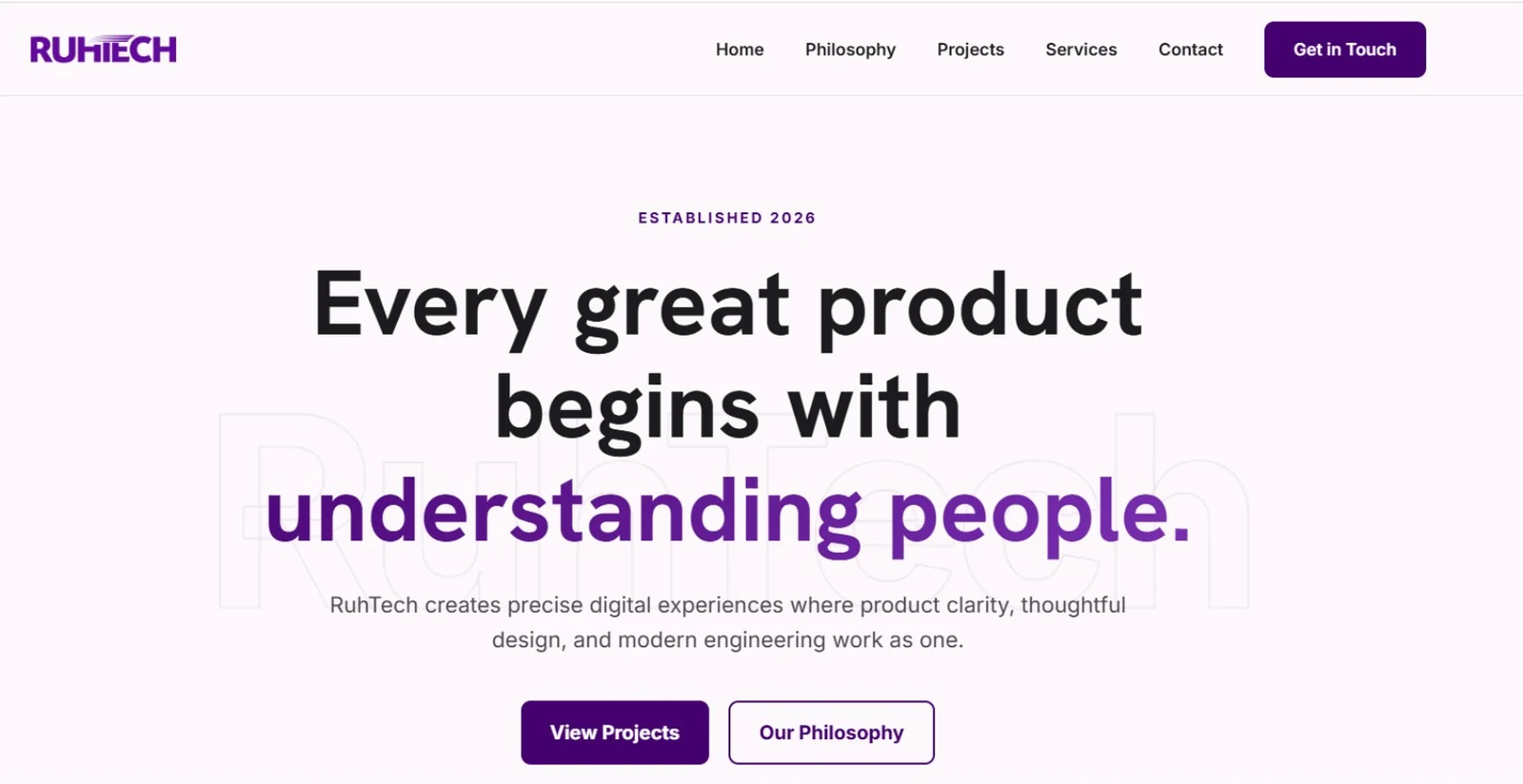
Every band of the first screen has one job, and each one leads the visitor deeper into the studio.
Five destinations and one action
“Get in Touch” stays visible in the header on every page.
A belief, not a feature list
The headline leads with the studio’s philosophy, the key phrase set in brand violet over an outlined wordmark.
Proof or principles
Visitors choose between seeing the work and understanding the thinking behind it.
Every path ends in a conversation
Philosophy, Projects and Services all lead to the contact page.
Decisions worth explaining
Typography carries the message
A large, confident sans serif headline does the work that imagery would do elsewhere, with the key phrase picked out in violet so it reads first.
The brand as texture
An outlined RuhTech wordmark sits behind the hero, giving the page depth and identity without competing with the copy.
A palette with one voice
Deep violet from the logo drives every button and highlight on a soft lilac white, so the identity feels consistent from wordmark to call to action.
The outcome
RuhTech launched with a website that states its belief in the first line, offers two clear paths into the studio and carries its identity from the wordmark to every button.